Every Liverpool New Balance outfield kit ranked
With Nike taking over as Liverpool's kit manufacturers, the club's partnership with New Balance has come to a conclusion.
August 1 saw the Nike deal come into effect, with the release of the 2020/21 home kit.
So now that the New Balance era has ended, we have decided to take a look back at their five-season collaboration with the Reds.
We will rank every New Balance Liverpool kit from 2015/16 to 2019/20.
It is the home, away and third kits, so there are 15 in total.
The rankings are mainly based on the kit design, but memories of the kits plays a part too.
15. 2015/16 third

Kicking us off is this effort from New Balance's first season.
This isn't necessarily a bad kit, it's just very forgettable, and quite bland.
It gets some points for a decent collar, but ultimately black and silver just doesn't really work.
Plus, there are some dodgy horizontal lines in the design at the front of the shirt that hinder it, rather than help it.
14. 2016/17 home
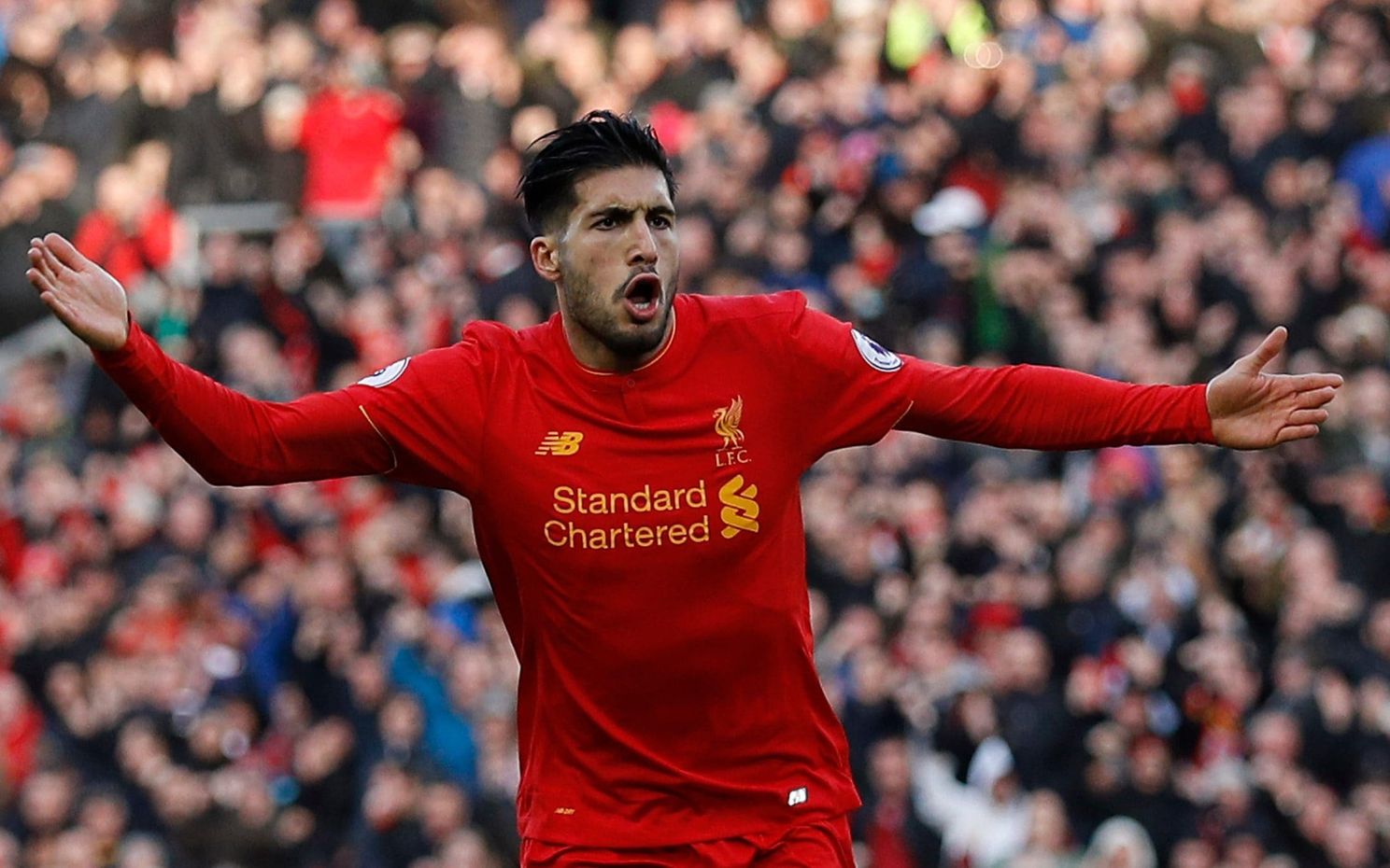
The second worst kit of Liverpool's New Balance era is the second home kit that they produced.
The yellow colour that has detailed some recent shirts just isn't that nice.
There is no real design to this kit, aside from a decent collar, and horrible, bulky shoulders that make the shirt look like an oversized blazer.
13. 2016/17 away

There isn't much separating this and the 15/16 third kit, both black with red and silver accents.
Yet this one has the memory of Sadio Mane destroying Arsenal on his Liverpool Premier League debut, which edges it up two spaces.
In terms of the actual look of the kit, it isn't much to write home about.
We wouldn't begrudge anyone who put this one last.
12. 2018/19 away

This is where opinions will probably start to differ.
Some may like this crazy effort, but others will have it rock bottom of the pile.
This could work if the purple was replaced with black, or if the orange was replaced with white.
But the purple and orange together is just too much.
11. 2015/16 home

This was the very first Liverpool kit produced by New Balance after they took over from Warrior in 2015.
There is a nice pattern in the shirt, and the white crest and sponsor is good too.
But then they went and stuck what looks like a collar around the neck. Except it's not actually a collar at all.
It just doesn't make any sense. It's like they drew the lines on the design sheet to indicate where the collar was meant to go, but they forgot to actually put it in.
If they had actually made it a nice round neck button-up collar, the shirt would feature much higher.
10. 2015/16 away
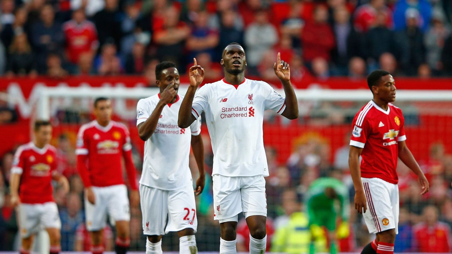
White and red has been the colourway of numerous Liverpool away kits, and it returned in the 2015/16 season.
Again, the design is quite simple, with a decent collar and nice sleeve cuffs.
White and red is hard to mess up, so this effort scrapes into the top ten.
9. 2016/17 third

Again, opinions will be divided with this hi-vis design.
More conservative fans would have this in the bottom two or three, but it's always nice to see something different.
This kit is a reminder of the peak heavy metal Klopp football, with Mane, Firmino and Coutinho running riot up top, while Dejan Lovren and Ragnar Klavan slept at the other end.
The kit matches the time - ludicrous.
8. 2019/20 home

This is where things get very tricky.
In terms of memories, this kit is, of course, number one. This was the home kit that Liverpool wore when they won the league for the first time since 1990.
But in terms of how nice it looks, this kit is very average.
It had potential to be great, as pinstripes are usually fantastic on shirts.
But they stop three-quarters of the way up the shirt for some reason, almost ruining the point of having them.
Then there is the fact that the crest and New Balance logo are gold, while the sponsor is white.
Surely they should all be the same colour.
If the pinstripes went the full way around the kit, and the crest, NB and sponsor were all white, this effort could have come top.
7. 2019/20 away

Coming in at seventh place is last season's white away kit.
This is where the shirts start to go from "that's fine" to "that's really nice".
Some may think that this is another uninspiring kit, with not much going on, but when you look closely you will see otherwise.
There is a really cool, almost tie-dye, design on the front which helps this kit a lot.
The fact that it is paired with navy shorts also helps.
6. 2017/18 away

This kit is one big missed opportunity, but it's still a lovely effort.
The green and white quarters featured on the 1995/96 away kit by Adidas, and it was one of the best away strips in Liverpool's history.
New Balance decided to pay tribute to that with this in 2017/18.
They made a good effort, but the green should have been a lot more visible.
All the same, they were on the right track and this could have featured higher.
5. 2017/18 third

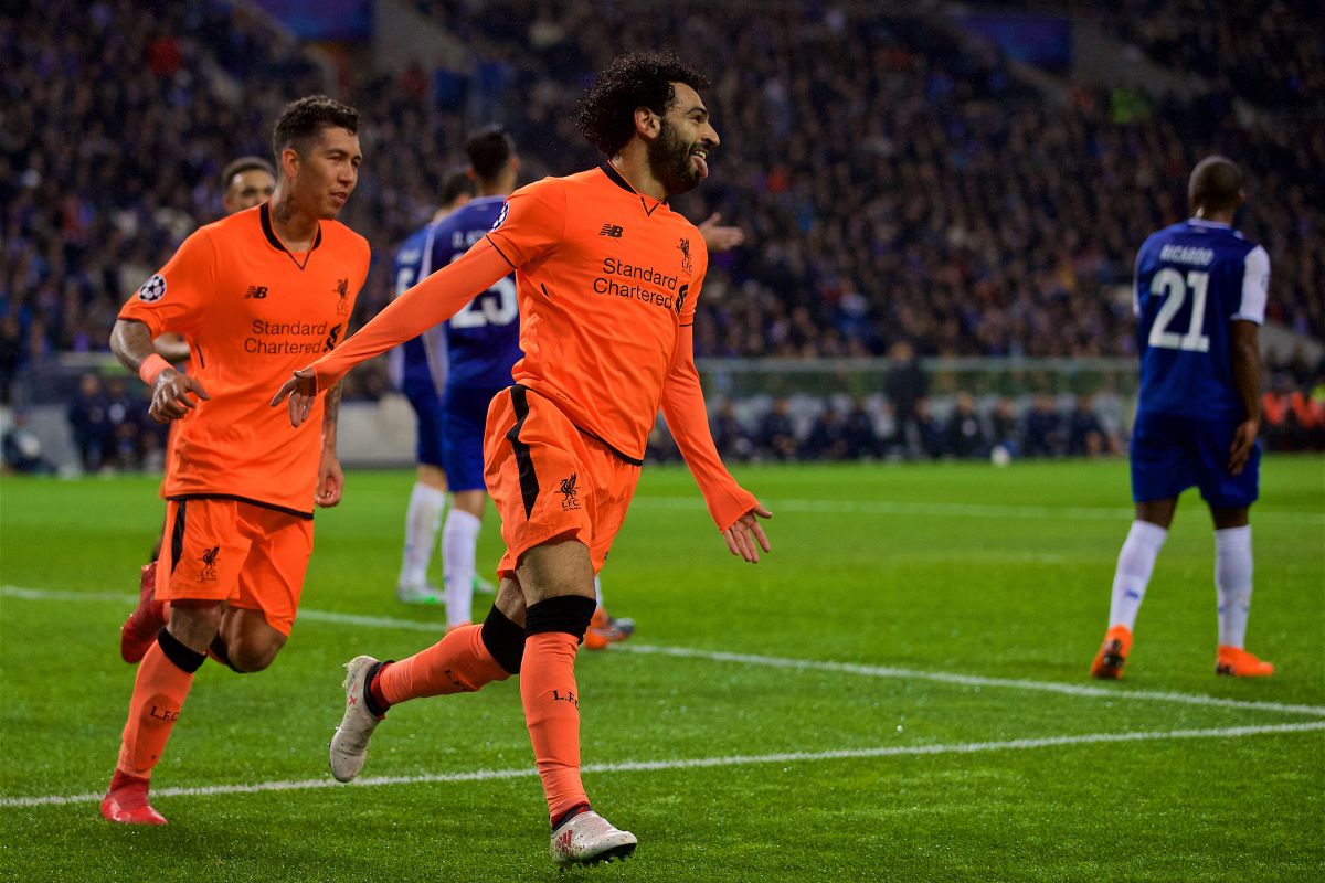
Another luminous New Balance third kit, more crazy Liverpool football.
Every time the Reds wore orange in 2017/18, they seemed to score a bucket load of goals.
It is no doubt a bit bright for some, but orange and black always works.
The memories help this into the top five.
4. 2018/19 third

Many will be surprised with this kit featuring so highly, but any fans of retro football shirts will have loved this design by New Balance.
The pattern is reminiscent of 90's kits, which are becoming more and more popular as urban streetwear in the present day.
This would be even higher if it wasn't for the darker grey on the sleeve, which takes away from the retro look.
3. 2019/20 third

The third best New Balance Liverpool kit is the third strip from last season.
Again, it won't be everyone's cup of tea, but it proves how great black kits can be if done right.
The mint details are beautiful too, and it is good to see the club experimenting with new colours on the alternative strips.
The cage-like design is a nice addition as well.
2. 2018/19 home

This kit very nearly topped the list, but ultimately it came out second-best.
A slick, simple design with the white details and a smart, button-up collar.
It also had a perfect fit, while the dark red is extremely classy.
Simple, but very effective.
Oh, and they brought home the European Cup in it.
1. 2017/18 home

And the winner is...
There won't be many arguments against the 2017/18 home kit being Liverpool's best of the New Balance era.
The American brand introduced a darker shade of red than they had previously used, which was a big hit with fans.
The retro-style V-neck collar and sleeve cuffs were classy inclusions, taking supporters back to Liverpool's prime in the 70's and 80's.
They may have lost out to Real Madrid in the Champions League final in this kit in 2018, but it served as a healthy reminder of Liverpool's roots.
That European run in this kit symbolised that Liverpool were back.


Place comments
0 Comments
You are currently seeing only the comments you are notified about, if you want to see all comments from this post, click the button below.
Show all comments